
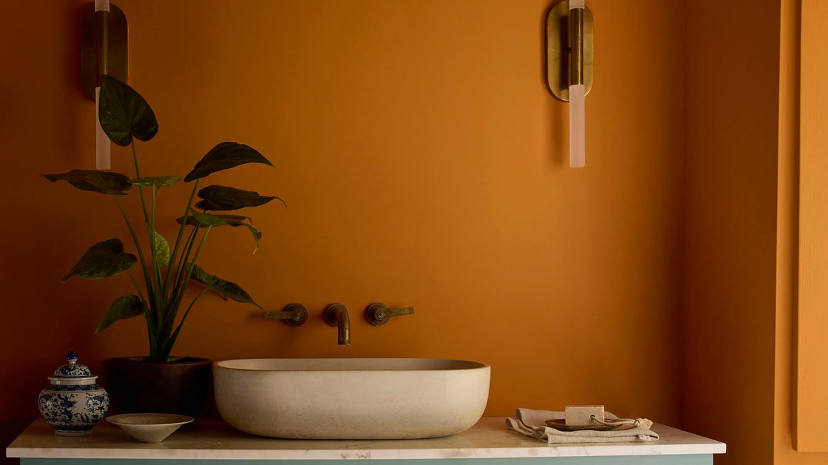
Little Greene Paint & Paper forecasts a trend toward interior color palettes that are balanced and rich in character. Ruth Mottershead, the brand’s creative director, observes a shift away from extremes—both vivid saturates and faint neutrals—toward shades that feel soft, layered, and full of personality. This move reflects a broader desire for interiors that are calm and thoughtfully designed, rather than trend-driven.
The brand’s updated Colours of England and Colour Scales collections embody this trend. Mottershead describes the change as an evolution rather than a sudden shift. “We’ve watched saturation quietly turn down across the palette,” she says. Warm, intense tones have softened into gentler, more balanced hues, marking a transition from bold statements to subtle elegance.
The Rise of Mid-Shade Neutrals
Mottershead points out the increasing popularity of mid-shade neutrals, colors that are neither too warm nor too cool. She compares these shades to a pH scale reading of 5 or 6, balanced and comfortable. “There’s a real appetite for shades with personality that don’t shout,” she explains, noting the rise of gelato-inspired colors in interior design. These shades, she adds, are particularly appealing because they offer a sense of comfort and consideration, aligning with the growing preference for spaces that feel intentional rather than fleetingly fashionable.
Related Post: Timeless elegance meets everyday comfort in refined dining room
Building a Lasting Palette
For those starting a decorating project, Mottershead offers practical advice. Start by selecting colors you love, not just following trends. Think about how you want the space to feel and how light moves through it. North-facing rooms pull coolness from colors, while south-facing spaces warm them up. She suggests letting the natural light of the room guide your choices, ensuring the colors work harmoniously with the environment.
She suggests picking a hero color first, then expanding with one or two shades sharing the same undertone. This creates a cohesive rather than pieced-together design. Mottershead also emphasizes the importance of testing shades, painting large samples and observing them in morning and evening light before deciding. This process, she notes, allows you to truly understand how a color will behave in your space over time.
A Storied Blue Takes Center Stage
Among the new collections, Mottershead is particularly drawn to ‘Perpetual Blue.’ This shade has a unique origin: it’s inspired by a preserved paint palette belonging to Winston Churchill, found in his studio at Chartwell. The color conveys a sense of quiet reflection and adapts beautifully to changing light throughout the day. It’s a mid to deep blue with a touch of green, making it both versatile and timeless. Mottershead envisions it as a rich choice for a study, where it can create a contemplative atmosphere, or as a grounding element paired with softer neutrals to add depth and character to any space.


