
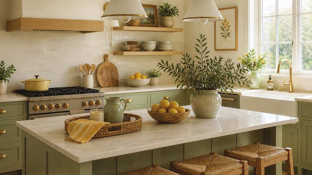
Canada’s cottage design scene has abandoned the once-dominant cool grays and stark whites in favor of a palette that emphasizes warmth and organic elements. Over the past twelve months, soft citrus shades and earthy tones, including muted yellows, sage greens, and sun-bleached neutrals, have become the cornerstone of a more inviting and understated look. Unlike earlier movements that demanded bold visual statements, this trend prioritizes creating spaces that feel serene and naturally lived-in.
Designers explain that this shift works because the colors subtly reflect the outdoors without appearing forced. Butter yellows and pale lemons introduce warmth by bouncing natural light around a room, while deeper greens like olive and sage anchor the design to seasonal changes. The effect avoids artificiality, instead capturing the gentle glow of sunlight filtering through foliage or the quiet depth of a garden’s underbrush. This approach ensures interiors feel connected to the natural world rather than isolated from it.
The trend extends beyond visual appeal into practical benefits. The chosen hues interact with daylight in ways that shift imperceptibly throughout the day, thanks to sheer fabrics, open window treatments, and reflective surfaces. These elements keep the space dynamic, preventing it from feeling static or overly controlled. The palette’s strength lies in its restraint; it thrives on layered textures like linen, cotton, and wood rather than rigid color matching, allowing materials to contribute depth without overwhelming the eye.
This design movement reflects a wider cultural emphasis on well-being over purely decorative concerns. Cottages, in particular, benefit from the shift because their traditional appeal has always centered on warmth and functionality. The new color approach doesn’t merely decorate; it transforms interiors into environments where occupants feel immediately at home.
The look materializes through careful, understated selections. A foundation of warm whites, creams, or soft beige serves as the backdrop, with color introduced gradually through textiles and finishes. For example, a linen-upholstered sofa might serve as the room’s anchor, while muted green cabinetry in the kitchen adds subtle contrast without heaviness. Even small touches, a woven basket, a single eucalyptus branch, reinforce the natural connection.
Texture plays a vital role in making the palette successful. Without varied textures, the soft colors risk appearing flat or one-dimensional. Materials like rattan, jute, and unfinished wood introduce dimensionality, ensuring spaces feel lived-in rather than artificially staged. The emphasis is on harmony over precision, with intentional variations in shade and finish keeping the design organic and adaptable over time.


